COLOR-TURAL CONTEXT: COLOR PERCEPTIONS ACROSS VARIOUS CULTURES
When studying color for advertising or design courses, we’re always given the basics, and often just the basics for our own culture. However, when working with clients on an international level, it is important to understand various cultures and their interpretations of colors.
The infographic below illustrates 84 different feelings, and the colors that represent each across 10 different cultures. It is worth it to really study these and understand how some feelings, such as passion, are universally interpreted by the color red; whereas, other emotions, such as love, are perceived as blue, red, yellow, or green, depending on the culture.
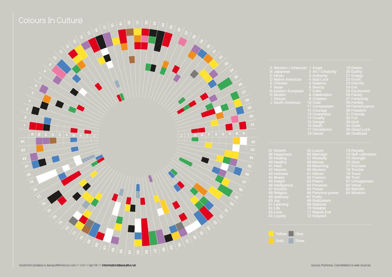
https://informationisbeautiful.net/visualizations/colours-in-cultures/
Another article lays out this information a little differently, and breaks up the information by color, then by culture, then which feeling(s) the color elicits.
http://www.k-international.com/blog/color-meanings-around-the-world/
Even if your client’s company is US-based, it is important to understand how other cultures may perceive the colors incorporated into your design. This is especially important if your client plans on going global at any point, or if your client’s product/service attracts people from two or more cultures.
These “cheat sheets” are great to keep as a reference for future clients and projects. An additional site that is a great color reference for color suggestions, trends, and inspiration is pantone.com.
Color is extremely important in the design process, and can make or break an entire design. It is pertinent to take cultural context into consideration for any design, as you never want your designs to come across as offensive, which can happen with simple color choices.