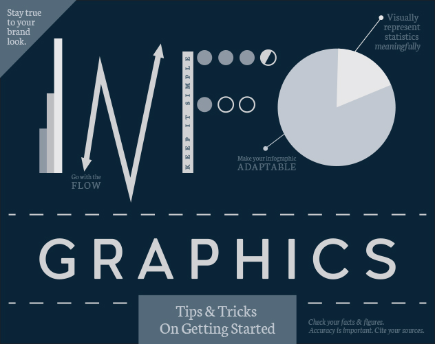
TIPS FOR A MEANINGFUL INFOGRAPHIC
Many people claim to hate statistics. What most people mean by that is, they don’t enjoy running statistical analyses, but people love to see/hear the final outcome of statistical analyses and love to be able to put numerical values to data. One trend that combines information (statistics) and visual graphics, are infographics. Info + graphics = infographics.
However, the ability to understand the given data/information, and make it visually appealing is one for artists and graphic designers. These infographics usually go on websites, get attached in e-blasts, posted on various social media platforms, and much more.
Want to incorporate infographics in your marketing materials, but feeling unsure of the best strategy to create these? Here are our tips on creating a meaningful infographic.
KEEP THE LOOK & FEEL WITHIN YOUR BRAND STANDARDS
When creating an infographic, make sure to use brand colors, fonts, images, etc. so that users will recognize that this infographic represents your brand.
USE THE “KISS” THEORY
You’ve heard it before – “keep it simple stupid” – this rule applies to infographics, too. The whole idea of an infographic is to visualize information in a way that viewers can quickly retain the information you’re trying to present. When reading, users look for keywords, big numbers, and basic sentences/headlines. No need to clutter up the precious space your infographic has with a novel – save that for the encyclopedias sitting in the library.
VISUALS, VISUALS, VISUALS
It is called an infoGRAPHIC, after all. Many infographics utilize illustrations and icons, but if your brand calls for real images, go for it. Make sure the visuals are relevant and appealing. For example, if you have an 80% statistic, you can create 10 of the same icon, but fill in 8 with a bright color, and 2 with a duller color to represent that information in a visual, but meaningful way. Don’t go overboard with graphics, though – make sure you have a reason for placing each image you do.
MAKE IT ADAPTABLE / EASY TO VIEW
This infographic could be placed in a multitude of platforms – email, Twitter, Instagram, or in a print publication. It needs to be able to be manipulated easily to fit different dimensions and types of media.
GO WITH THE FLOW
Most infographics have a sense of natural flow, your eyes easily move from one piece of information to the next. Some infographics have a lot more info than others, and some have various types of information that may not naturally flow together. So, go with the flow and make sure you can add arrows, dividers, or whatever it may take to give your information a natural organization.
ACCURACY: CHECK YOUR FACTS & CITE YOUR SOURCES
Before you even start designing your infographic, you have to make sure your information is accurate. If you’re using information from outside sources, you also need to make sure to give those places the credit they deserve. Typically, sources get put in small type at the bottom of the infographic, so as to not distract the viewer from the beauty of your infographic, but also to let your viewers know where your information came from.
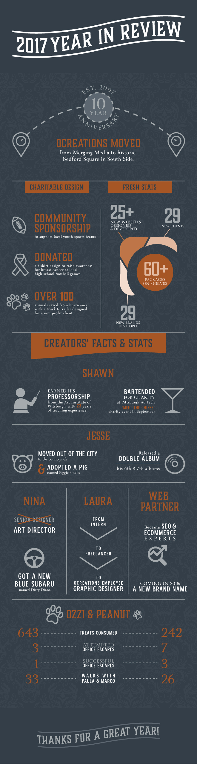
If your business has information that could benefit from an infographic, contact us at ocreations. We recently created an infographic for our company’s year in review 2017 recap. Check it out below!