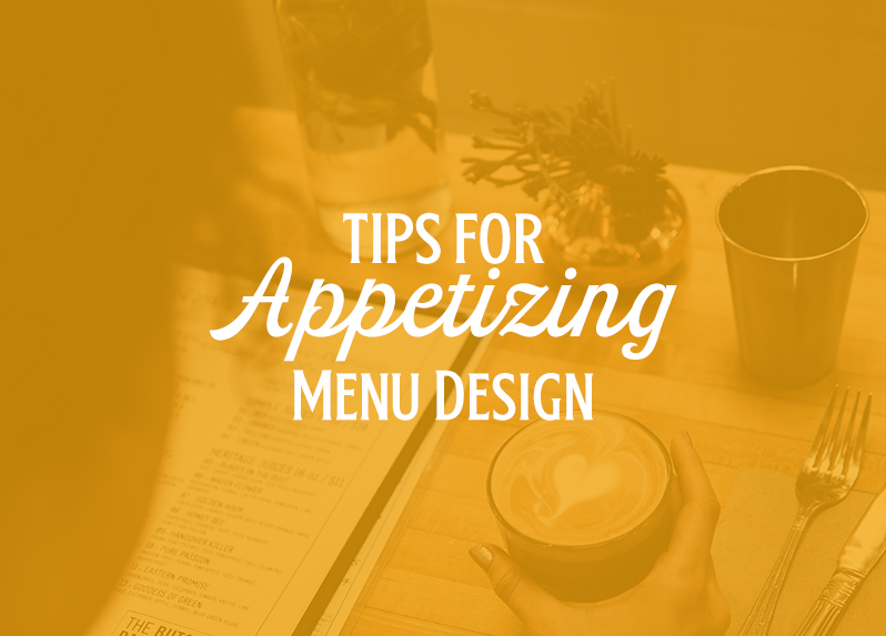
Appetizing Menu Design
You sit down at a restaurant, and your server hands you a menu. You skim the menu, pick what you’d like to order, and hand back the menu. People look at menus everyday, and it is so important for successful establishments to have menus that will catch someone’s eye and be memorable. There’s much more than meets the eye when it comes to menu design. Here are some tips on best practices for designing a restaurant or bar menu.
Organization
Divide your menu into categorical sections. This will make it easier from a usability standpoint, so the consumer can find what they’re looking for quicker and easier. It also creates a visual break and a sense of balance across the design as a whole. An organized menu also illustrates a sense of professionalism and expertise for the brand and/or owner. For instance, a food menu might be broken into categories such as appetizers, main courses, desserts, and beverages. Or, a brewery may categorize their beer selection by types of beers – IPA’s, Wheat Beers, Sours, or Stouts.
Use Photos Sparingly
Think of any high-end restaurant you’ve been to. Oftentimes high-end restaurants do not use many photos, if any at all. High-end restaurants want to leave the food up to its customers’ imaginations. If you want to use food photography in your menu, make sure the photos are extremely high quality. This can become costly, but can be worth it if you get the right photographer to produce great shots. And, this may go without saying, but only use photos of your own menu items. If customers see a stock image of a plate of nachos piled high with tons of toppings, and your restaurant doesn’t actually offer nachos with that many toppings, you may end up with a disappointed customer that may not come back for another meal. Transparency is so crucial in the food industry. Getting good photos of food is a challenge in itself, but can be worth it if that’s what your brand needs.
Consider Illustrations
Illustrations can provide a better sense of the brand/restaurant’s personality. Illustrations are also more universally-understood and often provide a friendly, sophisticated approach.
Keep the Dollar Signs Off
This doesn’t mean you need to keep the numbers / price off, however. Including dollar or currency symbols can clutter your menu, make it look repetitive, and bring down the level of sophistication you may be trying to demonstrate. Placing a dollar symbol in front of every number will make your customers overly aware of how much they are spending.
In addition, try to make your prices more subtle than the rest of the copy. For example, if all of your design is written in a black color font, try to make your prices a slate gray, or a slightly thinner weighted font for lesser emphasis.
Also, do not categorize your menu by price. Mix things up so your customers do not automatically skip past all of your more expensive items. This is a more neutral approach that will encourage your customers to read the menu in its entirety, and order based on their appetite, not their wallet.
Consider Utilizing Boxes or Lines
This goes along with organization. To make sure your customers understand the categorization of your menu, consider grouping each section into its own designated area. Whether you prefer boxes, or lines, these elements will enhance visual breaks and balance.
Typography & Colors
Choosing the right font and color combinations truly sets the tone of your brand as a whole. Select fonts and colors that compliment one another, and work as a team to illustrate your brand tone and voice.
Remember not to use too many colors, and to select colors that will resonate with your target audience as well as your brand. And, depending on the theme or origin of your menu items, also take into consideration cultural context of colors and fonts.
In terms of fonts, a standard rule is to use no more than three different fonts. This will ensure that your menu can have variety and show hierarchy, while also maintaining a consistent look. Too many fonts can become overwhelming and confusing for a customer to process. Try to keep consistency across your menu items. For instance, utilize an all-caps font for your main categories, use a bold title case for your specific menu items, and a regular or regular italic for the descriptions.
Incorporate Special Elements or Icons
There are bound to be items on the menu you want to make note of or call out to your customers. For instance, are there items that are especially spicy? Do you want vegetarian or vegan customers to know your establishment offers a variety of options for dietary restrictions? Rather than writing it out, create icons for these special cases. It will add an intriguing visual element, while also making your menu even more practical for customers.
The Key is in the Copy
Well-written menu copy can bring your menu to the next level. The copy will emphasize the brand tone, whether it’s serious, funny, whimsical, or blunt. Descriptor copy needs to be enticing and descriptive, yet simple and to the point.
Additionally, when writing copy for menus, take into consideration those with allergies. Descriptions should include basic ingredients to the dishes. For instance, if a dessert has a chocolate cheesecake with peanut butter drizzle on top, those with nut allergies would know to stay away from ordering that item.
And, don’t forget to proof read your copy during each round of design. Finding mistakes or making your copy better before it goes to print is always a good rule of measure. Spelling or grammar mistakes will make your brand look unprofessional.
Don’t Forget Your Logo in Your Menu!
Your number one brand identifier is your logo. Don’t forget to include this somewhere on your design. More often than not, restaurants will either include the logo on the front cover (if your menu folds or is multiple pages), or sits at the very top of the menu (if it is a single sheet).
Spotlight the Specials
Many restaurants or bars will have specials during certain seasons of the year, days of the week, or even times of day. If you want your customers to return for special offers, make sure to incorporate these specials on your menu, and make them stand out. Create a design element that will draw attention to that particular area of the menu.
Versatility in Print and Digital
Menus are one of those print pieces that now have to be easily adaptable for both print and web purposes. If your establishment has a website, new customers may be looking to peruse your menu before deciding to dine in. If your website doesn’t offer a digital version of the menu, you risk people losing interest and turning away. Give your new customers what they’re looking for and offer them a digital version of your menu that is responsive, and can be viewed on desktop or mobile devices.
Feeling hungry yet? At ocreations, we have worked with clients from a variety of businesses and backgrounds in the food and beverage industry, and who have requested menu designs. Check out samples of ocreations menu designs for various clients throughout the years. Ready to update your old menu design? Opening a new establishment and looking for a brand new design? Contact us today at ocreations. Let’s dig in, let’s get creative.