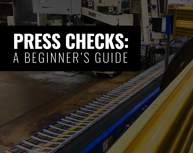
A BEGINNER’S GUIDE TO PRESS CHECKS
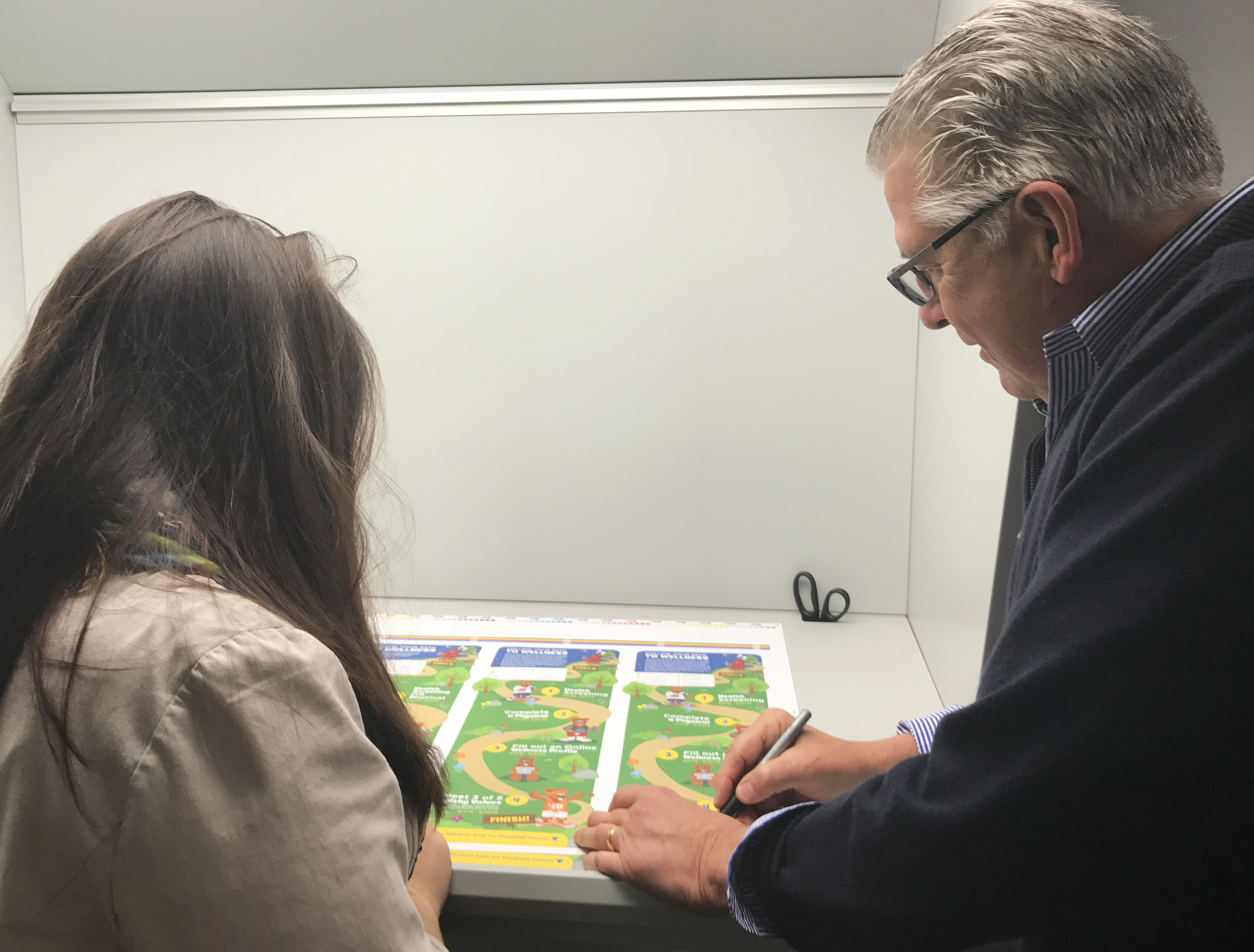
Going to your first press check and don’t know what to expect? A press check is the final step before the project goes to print so you can make sure the files are going to print exactly as you (or your company) envisioned. It’s important to know how to conduct yourself heading in, since a press check is your last chance to alter aspects of the piece before dozens, hundreds, or maybe even thousands of copies are printed. Don’t sweat it, though – we’ve got some tips to make you look like a pro.
What to Expect:
All projects are different, so each press check runs a little differently from one to the next. Length depends on the size of the project – if it’s a 200 page Visitor’s Guide, it could be a two-day event; if it’s a brochure, it may only last about an hour or so.
Prep your nose – press checks can be smelly. With all types of inks, papers, machines working hard on a variety of projects, a press room definitely has a certain odor.
Prep your ears – presses are very loud. At most facilities you will have your own waiting room to see and review your proofs. Some may have you go directly to the presses to view your proofs. If you’re not a fan of loud noises, many printers supply ear plugs for safety! Make sure to ask if they aren’t readily available.
And, always ask your print rep at the specific facility you go to if you are allowed to take photos. Some locations allow it, others do not.
What to Bring:
- The latest revision of color mockup proofs. This is going to be the key to cross-checking in the press room. Also a good note to bring along a typed list of changes that you may have made after you sent the files to the printer to confirm they have all the correct updates on their ends, too!
- If you can, bring along a laptop for any cross-checking, and for sources files. If you don’t have a laptop, or cannot bring one, save out the files on a disc or flash drive. Be prepared!
- Previously printed documents (whether it is the same printer or not), especially if this is a reprint or job that is similar to a previous job. This will be a good reference no matter what the print job entails.
- A swatch book, if you have one. This will come in handy when checking the colors across the publication. It is also especially important if there are Pantone colors that need to be printed in CMYK.
- A loupe, if you have one. This comes in handy when the publication has very fine details or small type/characters.
- Your ID! Some bigger print houses require an ID to sign-in, especially during an overnight/two-or-more day press check!
- Client & Designer! While not everyone can always attend, it’s always best if you are able to have a designer and client together. You’re both looking for different things and two (or more) sets of eyes are better than none!
- Snacks & Drinks: Most facilities provide small snacks & drinks for you during your time, but if you have specific favorite snacks & drinks, make sure to bring them along! If you have a multiple page job, you’ll usually have to wait an hour – sometimes even 5 or more between proofs. Talk with your rep ahead of time to get an idea of what it might be like.
What to look for:
- Check the stock/material
It’s important to crosscheck and make sure the printer used the correct paper, weight, and finish. There are many types of papers, weights and finishes, so if the press check is not printing well on the type of paper you selected, you’ll need to ask the printer whether it is an issue of the file colors, etc. or if it is an issue of the type of material it is being printed on. Your printer should have good recommendations of alternate options for best results.
- Compare with the mockup
Make sure to get out that printed out mockup you brought with you to make sure both files are consistent with one another. If not, point out what is inconsistent, and what needs to be modified.
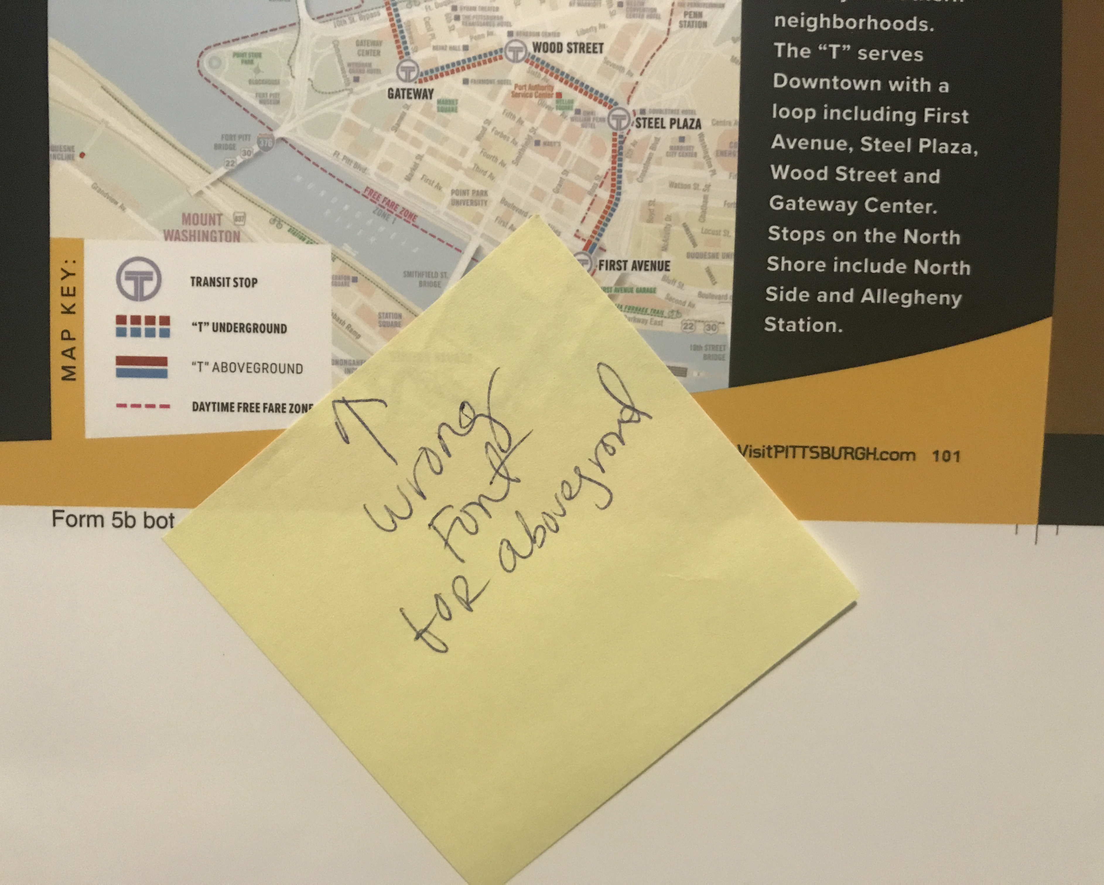
- Look at the fonts
When sending files to a printer, you should send the final PDF in outlines so that the printer does not replace any missing fonts. It’s important to send along the packaged file with fonts, images, etc. as a backup so they have all files needed for any necessary adjustments. This is especially key when working on large publications – always make sure to properly package your files when sending to the printer (that’s why it’s key to have some sort of digital backup with you at the press, just in case!)
- Check the images for color and resolution
Print jobs usually require all images to be CMYK at 300dpi. This part is key in your own preliminary pre-press routine before sending off the final files. Take a moment to go through all of your photos to double-check they are all CMYK, and at a minimum of 150dpi (though 300dpi is usually standard and required). Many printers also ask for the image to be sized at 300 dpi with <1% scale. That means if your entire image is cropped and scaled down to 5”x5” inside of your design, but the original image is 10×10” at 300dpi, take your image into Photoshop and resize/scale down to 5×5” at 300dpi. Always make sure to keep a copy saved of your original photo (just in case you need it at the original size again!).
The required resolution can vary from printer to printer, or depending how large the print job is. When checking the images on your print piece, make sure the image is as crisp as it is in your mockup/digital files. While working on your design, encourage the client to print out often (close to actual size) so they can get an idea of the quality ahead of time. Most of the time colors and images will print darker than what you see on your screen (various computer to computer, printer to printer). If you can, always ask for a hard proof before going to the press-check. It will allow you to see how your colors may look (and if you can’t make it to a press check, your printer will use that as a color reference). If you have a design will opacities, tints, color on color (i.e. dark blue on a medium blue background), hard proofs will allow you to see if you need to adjust your colors prior to the press check. Sometimes a 90% tint on top of a 100% color looks like enough contrast on screen, but it might not show up at all when printing.
During your design process and also at the press check, review the coloring of the images to make sure everything looks balanced. If you notice any inconsistencies (skin tones, blacks are too black, the photo has a red hue, etc.) let the printer know. They may ask you to provide a new photo, or they may be able to adjust the colors themselves.
- Compare colors
From page to page of a print publication, make sure the colors are consistent. This is when a swatch book could come in handy!
But, keep in mind that when you actually go to print, brochures/books/etc. are usually separated on “signatures” and that can affect ALL of your colors. There are various sizes of ‘signatures’, some come in on 8-page, 16-page, 32-page, and even a whopping 64-page for some of the larger print-houses. On a single sheet/signature you might have heavy red colors all over, but maybe on one page you have a photo of a green landscape. The overall reds on the page might interfere with the lush green in your photo. The printer can add and take away percentages of color to get the best of both worlds.
- Look for any other printing issues
Do you notice any dark spots? Are there any streaks? Point out any imperfections whether it’s the ink, the alignment, or any other inconsistencies between your digital files and the print files.
Ask questions if you’re unsure!
Press checks are your final opportunity to make sure your print pieces will meet your expectations (and hopefully go above and beyond). It’s important to attend a press check, as that is the time you can make any minor changes before the files are printed. If you’re unsure of anything, that is the time to ask questions, so don’t be shy! Speak up if something does not look right. Make sure to be as specific as possible when asking questions or if you think something needs to be modified. The printers will be able to best advise next steps.
Note: If you do need to make changes, it could get expensive, depending on how many changes need to be made and the type of changes that need to be made. Check with your printer, and they’ll be able to give you an idea of the price tag on any requested alterations.
At ocreations, we love working on print projects. Though we are not a print shop, we work closely with great printers and will make sure your project is placed into the right hands. We’ve attended many press checks and are always eager to attend them to make sure the projects are printed pristinely. Contact us today if you’re interested in working with us on print pieces!