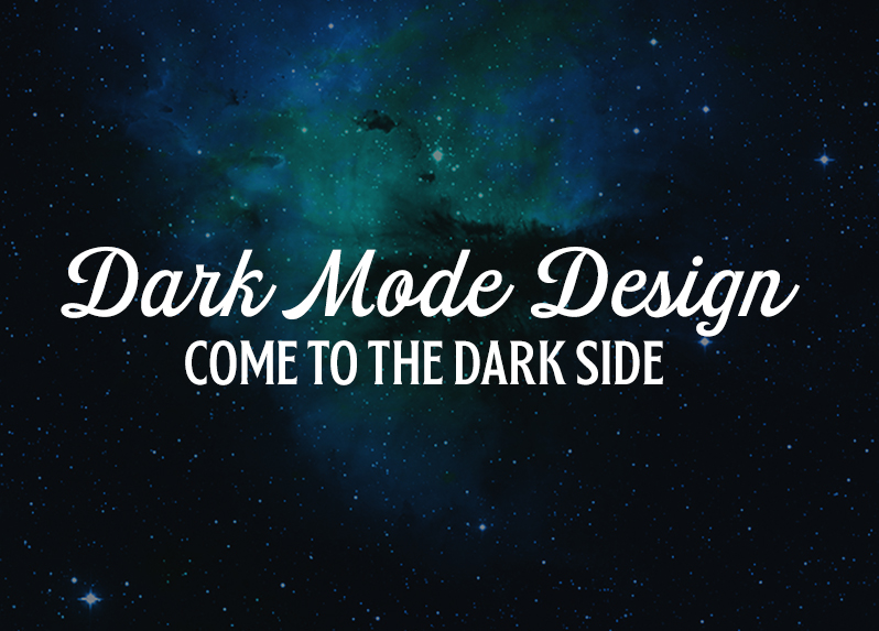
Come to the Dark Side….
Recently, digital designers have “gone to the dark side,” so to speak. A new design trend, dark mode, has become increasingly popular. What is it? Why is it used? And what are the pros and cons? We have the answers.
What is Dark Mode?
Dark mode is an alternative visual representation of an interface. Take Twitter for example. Users have the option to view the app in a day/light mode, or a night/dark mode. In day / light mode, the background color is a white or slight gray, and text is a dark gray or black. In night/dark mode, these colors are reversed so a lighter text is on a darker background.
Why Do Users Love It?
It Helps Them Read at Night
After a long day of sitting and staring at a computer screen, people continue to stare at their mobile devices. Dark mode actually makes it easier for users to read in the dark or at night.
Tip: If you want even better readability on your dark mode copy/content, try using a lighter font weight and loosening your kerning and leading slightly.
Power of Choices
Users can now decide how they want to view content. Giving people options and power to choose creates a positive perspective towards the interface and the company behind the interface.
It’s Something Different
Users are always looking for something new and exciting. Dark mode is (one of) the next best things in user interface design. It is the complete opposite of what we think of as traditional design, which makes it memorable and more appealing for users.
Fun Fact: Actually, the very first computers screens were built on a dark mode for programmers, who would need to write and read a lot of code over long periods of time.
When Dark Mode Works Well
If Your Audience is Using Your Interface in Dark Lit Situations
Take the entertainment industry for example. People often watch movies or TV shows in more dimly-lit atmospheres. Creating a dark interface makes the most sense for the audience and the environment, and will make for a more natural and easier interface interaction.
When Branding Scheme Warrants It
Sometimes you luck out when working with a brand. Like the saying “if the shoe fits” it may definitely work in your favor to use dark mode.
When Design Calls for High Contrast or ADA Compliance
When designing an interface or website that requires ADA compliance (which requires high contrast for readability), dark mode can come in handy. This is helpful especially if your audience is going to be using the interface in dim-lit situations, or needs extra contrast for readability.
Check out this nifty tool that can help you build a color palette that is high contrast and ADA compliant:
https://toolness.github.io/accessible-color-matrix/
When the Design is Sparse and Minimalist with Few Content Types
Tip: Dark gray or dark blue are the best colors to use for a background of a dark mode interface. As opposed to complete black, dark grays and blues allow our eyes to see shadows, and slightly less contrast than strictly black on white. Not everything is black and white – even in the design world!
Pros of Dark Mode:
- Reduces eye strain
- Elicits emotions like mystery and intrigue
- Creates dramatic feel/look
- Creates sense of luxury and prestige
- Supports visual hierarchy
- Conserves battery power
- That’s right – not only does this type of design conserve your eye’s “battery power” – it will conserve your device’s battery power as well. A dark interface uses less light pixels, thus saving your device’s battery.
When Dark Mode Does Not Work Well
If Your Content is Text-Heavy and Dense with Data
If you’re designing for a project that involves a lot of content that is text heavy, or involves a variety of content (such as text, images, video, drop-downs, forms, etc.) it is advised to stick away from dark mode. Too much reversed out type on a dark background can become overwhelming if there is too much content.
If Your Content Needs to Utilize a Variety of Colors
The possibilities are almost endless when it comes to picking out colors that will be readable on a white background. However, picking colors that are readable and truly pop on a dark background are fewer and far between. There are only a certain number of colors that have sufficient contrast against dark backgrounds.
So, now that the basics are laid out on the table, definitely think about the possibility of designing for dark mode for your next web or digital project. It could be exactly what your client or audience needs!
Ask us about our web services. We can help your business design & develop a site. We can also make ongoing updates to your site (blog writing, news posts, etc.). And, we can keep your site to rank highly with SEO services. Or, even make sure your website is always up-to-date with monthly and quarterly maintenance packages. Contact us today.
Let’s get web-friendly, let’s get creative.