Tips for Great T-Shirt Design
Designing a t-shirt for a client (or yourself)? Time to roll up your sleeves and get to work… right after you read our tips for designing shirts that you and/or your client will never want to take off!
Sizing
When it comes to t-shirt designs, it’s important to keep the size of your design on the shirt at an appropriate size. For starters, a design that is too large is going to be distracting and awkward. For instance, shapes such as circles and squares tend to look better when sized smaller than standard.
Something else to consider is what type of apparel your design is going to be printed on. Consider a smaller size for youth sizes (some max out at just 6 inches wide), and take into consideration pockets and their placements on t-shirts or hoodies when sizing your design.
Not to mention, the larger the design, the more ink you use, the more expensive your shirts become to print. At the end of the day, you want people to notice your shirt for its great design, not be blinded by its overwhelming size.
If you’re nervous about the sizing, something designers will do is print out their design on a standard sheet of paper and hold it up to their own shirt. If you’re still nervous, it’s probably best to talk directly to your printer when you provide the art files to make sure they size it appropriately.
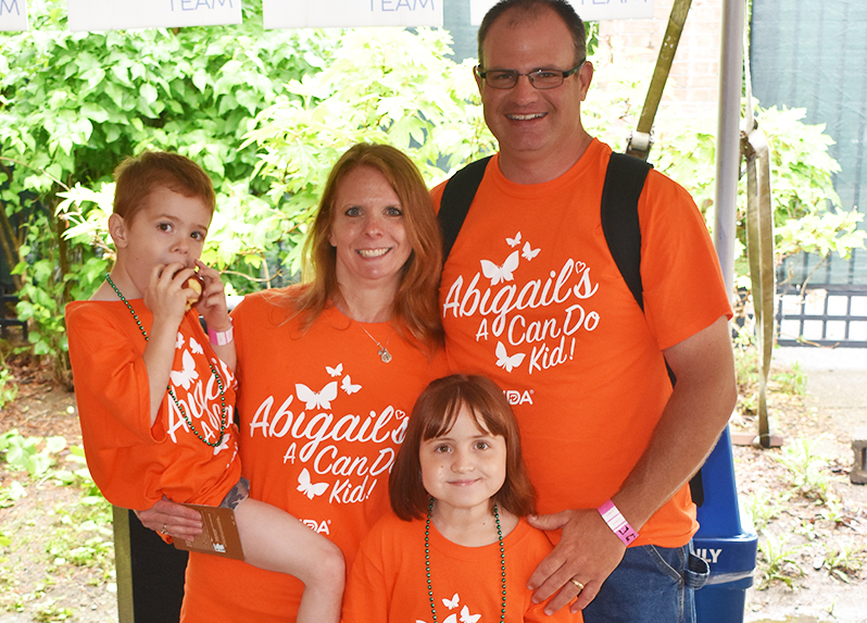
Check out an example of a t-shirt design ocreations recently donated to a local family in support of the Muscular Dystrophy Association:
Placement
Placement is another major factor in making or breaking a great t-shirt design. You could have the greatest design in the world, but if it is placed awkwardly, it can take your design down (literally) from amazing to mediocre.
Shirt designs should ideally sit about 3-4 inches from the collar of the shirt, and sit on the chest area. It is not flattering (for design and for the person wearing the shirt) to have a big design resting on the stomach.
Below are standard placement options (for most screen printers):
- Front Center
- Left Chest (small)
- Center Back
- Center Upper back (small)
- Sleeves
And, here are some unique placement ideas for you next shirt design. Make sure to check with your screen printer before sending art files:
- Bottom front
- vertical front (right or left side)
- Front bleed onto the shirt side
- Shirt sides
- Vertical black (right or left side)
- Back bleed onto the shirt side
- Full front or Full Back
Typography & Fonts
Selecting the right fonts and making sure your typography is visually appealing are key to great design and legibility. Add variation to your type design by using multiple fonts – but don’t use too many fonts to keep things simple (make 3 fonts your limit). Or, use one font, but put emphasis on certain words by using heavier font weights. Pick out the right font for the message you’re trying to convey. A collegiate block letter style might not be the most suitable font choice for shirts for a bridal shower. And, never use Papyrus (trust us).

Colors
Colors can also make or break your shirt design. Just like fonts, you should try and limit your color choices. The more colors you include in your design, the higher chance for making your design look too busy, and the higher chance for clashing colors. When in doubt, try and use as few colors as possible.
From a financial standpoint, one color is going to be your most affordable option. The more colors you use, the more expensive your shirts become.
Sometimes printers will use a technique called halftones, which is basically a pattern of small dots that can make your designs appear to have more colors, when in reality having fewer. It can save you money and make your design pop!
In relation to color, also keep contrast in mind. definitely make sure your design has plenty of contrast. This will help make your design more visually appealing, make it pop, and make it more legible. However, a low contrast design can work in your favor in certain cases. For instance, if you’re going for a vintage or distressed style, low-contrast can accomplish that goal with the right color selection.
Image Quality
One of the biggest complaints/problems that arise in a shirt print shop is the quality of the image in the design. Ideally, designs should be in vector format, so they can be scalable for all different sizes and types of apparel. However, if you’re using an image in your design, make sure it is high enough resolution. In a perfect world, 300dpi is the ideal resolution for an image that is going to print. 72dpi is the standard for web resolution, and will turn out pixelated on your shirt design, especially if it needs to be enlarged by a significant amount. If you’re using an image in your design, it may be a good idea to send the image to your printer before you start designing to make sure the image will print at the best quality possible. If your printer has doubts, you will be able to know and readjust your design before getting too deep into the design phase.
Below are samples of shirts ocreations designed for the 2017 Pittsburgh Irish Festival.
![]()
Simplicity Is Key
Just like many other things in life, simplicity is key when designing for t-shirts. Your eyes can only process so much at once – don’t let your design overwhelm your audience’s eyes! Don’t let your creative ambition get the best of you – if you’re starting to think you’ve gone too far, you’ve definitely already gone too far. It’s easy to get carried away in the moment when designing. During your process, it’s always a good idea to take a step back, or let yourself sleep on your design. Take a break and let yourself take another look with fresh eyes and a fresh perspective.
Always Mock It Up
One of the best practices during the design process is to take your concepts and mock them up on an image of a t-shirt. You’ll be able to get a better idea of how your shirt will turn out before actually going to print. A mockup may make you realize you should invert your design, swap colors, make certain fonts bolder, etc. This can save you time, money, and a headache.
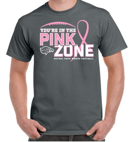
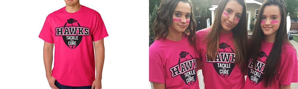
See an example of a shirt ocreations designed for Bethel Park’s football team to raise awareness for breast cancer during the 2017 season. On the left is a mockup of the design, and on the right is the final product!
Designing a shirt that people will notice and want to wear can be a great challenge. Don’t forget to take into consideration sizing, placement, color & typography, image quality, and simplicity. A design that’s well balanced and simple is going to stand out the most, and won’t get stuck at the bottom of the drawer!
Need a shirt design? Contact us at ocreations. As you can see, we have plenty of experience designing shirts over the years for a variety of clients. We’re always up for the challenge of a new shirt design. Let’s roll up our sleeves, let’s get creative.