OCREATIONS LAUNCHES ONE FEDERAL CREDIT UNION IN MEADVILLE
The Meadville Area Federal Credit Union needed a change. When these lovely folks contacted us to rebrand and rename their Credit Union, they had a clear vision, but no road map. Our task was simple: Create an energetic, fresh brand that required the common “banker” to rethink everything they know about credit unions. With a tagline like “Banking…But Better,” we knew that this brand had to be intriguing and unique.
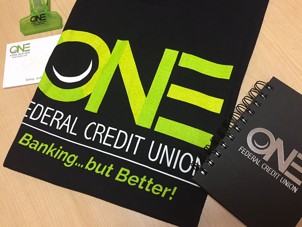
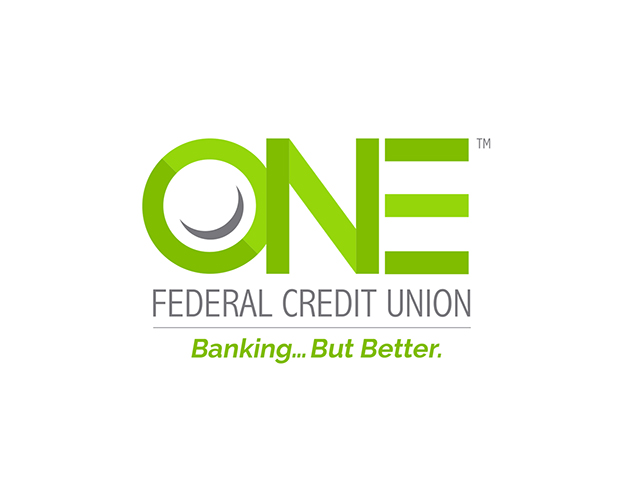
The new name of the company would be ONE FEDERAL CREDIT UNION. We submitted a few different rounds of concepts and design variations, and settled on a logo that was flat with subtle color shifts to give it some lift and dimension. We chose vibrant green, black and gray. They loved the concept that contained a smile hidden inside of the letter “O.”
When the logo was finished, we had a blast working with the team at ONE FEDERAL CREDIT UNION on the website, live action commercial, brand standards website, team apparel, and many other promotional pieces. We truly have never seen so much energy and enthusiasm dedicated to a brand within a company. This is an example of an organization that really understands the value of a strong logo and brand identity.
Thanks, we love you guys!